
10+ Best Dental Practice & Specialty Clinic Website Designs (2027)

Here is an uncomfortable truth about dental practice website design: your patients have already judged you before they read a single word of your bio. It takes about as long as a blink for a visitor to form an opinion about whether your practice looks trustworthy, modern, and worth booking. No amount of clinical excellence in the chair fixes a slow, cluttered, stock-photo-filled homepage that loses the patient in the first three seconds.
That single moment now happens twice. Once on Google, and increasingly again inside AI search tools and chat assistants that patients ask directly for "the best dentist near me" or "a pediatric dentist my kid won't be scared of."
The dental practices winning both moments in 2027 share a specific playbook: one part visual design, one part conversion psychology, and one part technical SEO and GEO groundwork most competitors still skip.
We pulled apart 12 of the best dental practice and specialty clinic website designs on the internet right now, spanning general and family dentistry, cosmetic dentistry, pediatric dental, orthodontics, and oral surgery and implant centers, to show you exactly what each one gets right and how to apply it to your own site.
Why Dental Website Design Matters More Than Ever in 2027?
Most patients now research a dentist or specialist online before they ever pick up the phone, and a growing share of that research starts inside an AI assistant rather than a traditional search bar. A slow, generic, or confusing website does not just look bad; it actively costs a practice new patients before the front desk ever gets a chance to answer the phone. Mobile visitors in particular abandon a page within a few seconds if it loads slowly, and for a category where most searches happen on a phone in the middle of a toothache, that speed penalty is brutal.
Design is also doing more emotional work in dentistry than in almost any other local service category. Dental anxiety is real and common, and a cold, clinical-looking website amplifies it before a patient even walks through the door. The best dental practice and specialty clinic website designs treat the homepage as a kind of digital chairside manner: calm colors, real human faces, and language that addresses the patient's real fears rather than just listing procedures.
What the Best Dental and Specialty Clinic Websites Have in Common
A visible booking action above the fold. Not buried in a menu, not three clicks deep. "Book Now" or "Request an Appointment" sits in view the second the page loads.
Real photos and video, never stock imagery. The actual doctor, the actual team, the actual waiting room. Patients can tell the difference instantly, and it either builds trust or quietly kills it.
A calming, purpose-built color palette. Soft teals, warm whites, and navy with a warm accent color. Aggressive clinical reds and harsh contrast are largely gone from the best examples.
Fast, mobile-first performance. Since most dental searches happen on a phone, a site that is not built mobile-first is built to lose patients.
Insurance, financing, and cost clarity. Cost anxiety keeps more patients from booking than almost any other single factor, so the strongest sites answer it early and plainly.
Content written for humans and for AI answer engines. Clear service pages, structured FAQs, and clean schema markup so the practice shows up whether a patient types into Google or asks an AI assistant.
12 of the Best Dental Practice & Specialty Clinic Website Designs
These examples span the categories patients actually search for: general and family dentistry, cosmetic dentistry, pediatric dental, orthodontics, and oral surgery and dental implant clinics, so whatever kind of practice you run, there is a directly comparable example below.
1. Paddington Dental Surgery: A Full Custom Rebuild That Modernized a Long-Standing Practice

General & Family Dentistry
This Sydney practice recently went through a complete custom website overhaul rather than a template refresh, and the difference shows. The rebuilt site delivers a smooth, responsive experience across every device, gives equal weight to service pages, the practice's philosophy, and an integrated educational blog, and layers in a current SEO- and AI-search-ready content structure beneath the redesign.
Design takeaway: A redesign should upgrade what is invisible (page speed, mobile responsiveness, and content structure) just as much as what is visible. The most polished homepage in the world will underperform if its underlying technical foundation is outdated.
2. Forni Dental: Warm, Original Branding Over Generic Templates

General & Family Dentistry
Forni Dental pairs a clean, uncluttered layout with a warm color palette and original photography of its own team and space rather than borrowed stock imagery. Online booking, clear service highlights, and detailed patient resources are part of a design that feels personal to the brand rather than interchangeable with any other dental site in the country.
Design takeaway: Warmth and professionalism are not opposites. A soft palette and original photography can still sit inside a clean, modern, conversion-focused layout.
3. Jackson Family Dental: Built Around the Family, Not Just the Practice

General & Family Dentistry
Jackson Family Dental leans into its name with a homepage built around multigenerational patient stories rather than a generic services grid. Navigation is simplified around the two questions most family patients actually have: which dentist should treat my child, and which one should treat me?
Design takeaway: If your practice serves a specific type of household or patient, structure your navigation and homepage story around that reality rather than a one-size-fits-all service menu.
4. Dentologie: Editorial, Boutique Design for Cosmetic Dentistry

Cosmetic Dentistry
Dentologie reads more like a beauty or lifestyle brand than a traditional dental office, with refined typography, an editorial layout, and a visual tone that matches what cosmetic patients are actually shopping for: confidence, not just cleanings. The design treats each cosmetic service almost like a product, with clear before-and-after style proof points throughout.
Design takeaway: Cosmetic dental patients are closer to beauty or aesthetics buyers than to general dental patients, and the website should look and read that way, not like a clinical brochure.
5. Grand Street Dental: Minimalist Layout, Maximum Trust Signals

Cosmetic Dentistry
Grand Street Dental uses generous white space, a restrained color palette, and simple, confident typography to let the practice's work and reviews do the talking. Nothing on the homepage competes for attention with the booking button or the smile gallery.
Design takeaway: Minimalism is a trust signal in cosmetic dentistry. The less a homepage tries to sell, the more credible the practice tends to feel.
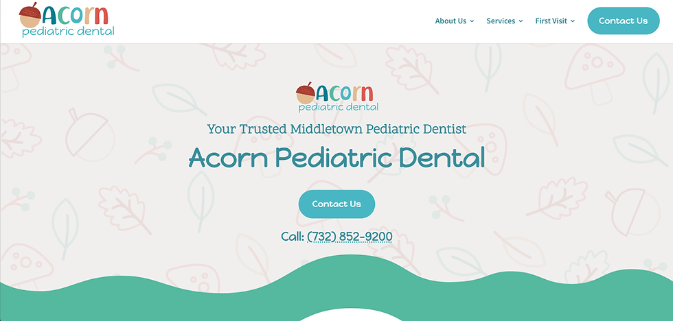
6. Acorn Pediatric Dental: Putting Parents at Ease First, Kids Second
Pediatric Dental
It is tempting to design a pediatric dental site purely for the child. Acorn Pediatric Dental gets the order right: the copy and structure speak directly to the anxious parent doing the research while the child-friendly branding and imagery reassure them that their kid will actually feel comfortable in the chair. Clear answers to common parent questions and an obvious booking path round out the homepage.
Design takeaway: The parent is the buyer, and the child is the patient. Design copy and calls to action for the person making the appointment, not just the person sitting in the chair.
7. CVD Kids: Color and Illustration Done With Restraint

Pediatric Dental
CVD Kids uses a colorful, illustrated design language throughout but keeps navigation simple and information easy to scan underneath the playfulness. The site never sacrifices clarity for cuteness; parents can still find hours, insurance information, and a booking form in seconds.
Design takeaway: Playful branding works for pediatric practices, but only when the underlying information architecture remains as simple and fast as that of a general dentistry site.
8. Royal Orthodontics: Technology and Personalization as the Brand Story

Orthodontics
Royal Orthodontics leads with its board-certified orthodontists and its use of advanced 3D scanning and printing technology, turning a technical capability into a trust-building story rather than a buried list of features. Boutique, personal branding keeps the practice from feeling like a faceless orthodontic chain.
Design takeaway: If your practice has genuine technology or clinical differentiators, feature them prominently. Patients researching orthodontics actively compare technology between practices before choosing one.
9. Reichheld Ting Orthodontics: Vibrant, Family-First Branding That Still Converts

Orthodontics
This practice opens with bold purple-and-yellow branding, a friendly logo, and photography and video featuring real kids, teens, and parents rather than posed, clinical shots. Underneath the personality, the site still delivers a genuinely functional homepage; an elegant multi-action call-to-action widget lets a visitor call, email, or book in a single tap, and mobile performance matches the polish of the desktop experience.
Design takeaway: Bold, personality-driven branding and rigorous conversion design are not in tension. The best orthodontic sites prove you can have vibrant character and a flawless booking path on the same homepage.
10. Rocky Mountain Oral Surgery and Implant Center: Calm, Credible Design for a High-Anxiety Category

Oral Surgery & Dental Implants
Oral surgery is one of the highest-anxiety categories in dental care, and this practice's website design responds with a deliberately soothing blue palette, generous white space, and a clean, easy-to-navigate structure. The visual choices are not decorative; they are functional, designed specifically to reduce a nervous visitor's stress before they even read a single service page.
Design takeaway: Color psychology is not a nice-to-have for high-anxiety specialty clinics. Cool, calming tones paired with uncluttered layouts measurably change how safe a patient feels before they book.
11. Sherwood Oral Surgery & Dental Implant Center: A Human Story Behind a Technical Specialty

Oral Surgery & Dental Implants
This father-son surgical practice leads its homepage with the partnership story rather than a list of procedures, then backs that warmth with genuinely strong technical content: a dedicated section for same-day, full-arch implant treatment, clearly explained financing options, and plain-language explanations of complex oral surgery procedures that never talk down to patients.
Design takeaway: A specialty practice can lead with a human story while still delivering rigorous, jargon-free procedural education. Patients researching surgery want both reassurance and real information, not one at the expense of the other.
12. Aspen Dental: The Corporate Playbook for Handling Objections Fast

Multi-Location & General Dentistry
As a large, multi-location dental brand, Aspen Dental's homepage is designed to address the three objections that stop most dental bookings before they start: cost, insurance, and availability, all within the first scroll. A prominent insurance-accepted banner and a clear message for uninsured patients remove the two most common reasons a visitor leaves without booking.
Design takeaway: Whatever your practice size, identify the two or three objections that actually stop patients from booking and answer them visibly on the homepage, not buried three pages deep.
The pattern across all 12?
None of these practices are winning purely on looks. Every single example above pairs a deliberate visual and emotional strategy with unglued, practical conversion mechanics: fast load times, an obvious booking action, real trust signals, and content written in language patients actually use when they search, whether that search happens on Google or inside an AI assistant.
How to Apply These Dental Website Design Lessons to Your Own Practice
If your practice is... | Borrow this design lesson. |
|---|---|
General or family dentistry | Structure navigation around real patient households, and rebuild the technical foundation, not just the visuals, during any redesign. |
Cosmetic dentistry | Design like a beauty or lifestyle brand: editorial layout, minimal clutter, and strong before-and-after proof. |
Pediatric dental | Write and design for the parent making the decision; keep navigation simple underneath the playful branding. |
Orthodontics | Feature real technology and real families, and make booking a one-tap action from anywhere on the site. |
Oral surgery or implants | Use a calming color palette and plain-language procedure pages to directly reduce pre-visit anxiety. |
Multi-location practice | Answer cost, insurance, and availability objections above the fold on every location page. |
How Pravaah Helps Dental Clinics In the USA Fill Their Schedules
If you've ever felt like your website is just a digital business card that sits there doing nothing, you’re not alone. Most practice owners we talk to are incredible at what they do in the clinic but feel completely frustrated that their website isn't bringing in the high-value cases they actually want.
That's where Pravaah Consulting steps in. We look at your website not as an artistic project, but as the hardest-working receptionist on your team.
Here is what changing that mindset actually looks like in practice:
We remove the hidden friction. Patients coming to your site are often in pain, anxious, or short on time. By redesigning user flows to be calming and dead-simple to navigate, we make booking an appointment feel completely effortless.
We build for how people search today. It’s not just about Google anymore. Patients are asking AI assistants for recommendations for local clinics. We optimize your practice to show up front and center across both traditional search and generative AI tools.
We measure what actually matters. Sleek graphics are great, but booked chairs pay the bills. We obsess over conversion rates, tracking every click to ensure your site is continuously generating real practice growth.
A Quick Story from the Field: A growing multi-specialty dental practice came to us with a beautiful site that just wasn't converting. Despite good web traffic, prospective patients kept dropping off before scheduling.
By auditing their user journey, restructuring their service pages for quick readability, and adding a clear, fixed mobile booking bar, we helped them increase online appointment bookings by 42% within the first 90 days without spending an extra dollar on ads.
At the end of the day, you focused on years of your life learning how to provide exceptional patient care. You shouldn't have to become a full-time web developer or marketing strategist to keep your practice thriving.
Is Your Website Sitting There Doing Nothing?
Don't let a slow, generic website leak high-value patient cases to your competitors. Let's turn your site into the hardest-working receptionist on your team.
Takes 30 seconds to request • 100% Free • No obligation
Frequently Asked Questions
1. What makes a dental practice website design effective in 2027?
An effective dental practice website design combines a visible online booking button, real photos of the doctor and team, a mobile-first layout with under-three-second load times, and clear answers to questions about cost, insurance, and availability within the first scroll. Practices that pair calming visual design with fast technical performance and structured, easy-to-find information convert the most visitors into booked appointments.
2. How much does a professional dental website redesign typically cost?
A custom dental practice website typically ranges from a few thousand dollars for a template-based build to well over $20,000 for a fully custom design with original photography, video, integrated scheduling, and ongoing SEO support. Cost depends on the number of pages, whether the practice needs multi-location or multi-specialty support, and how much custom content and video production is included.
3. What is the difference between a general dental website and a specialty clinic website design?
A general dental website design usually covers a broad range of services for a wide range of ages and needs a warm, all-purpose tone, while a specialty clinic website design, such as orthodontics, pediatric dentistry, or oral surgery, needs a narrower focus, deeper procedure education, and a tone matched to its specific patients. Pediatric sites lean bright and playful, orthodontic sites lean personal and transformation-focused, and oral surgery or implant sites lean calm, credible, and detail-rich to ease pre-procedure anxiety.
4. Do dental websites need to be optimized for AI search and answer engines, not just Google?
Yes. Patients increasingly ask AI tools and chat-based search directly for the best dentist or specialist near them, so dental websites now need clear, self-contained answers to common questions, structured FAQ and service content, and clean schema markup that answer engines can read and quote. A dental website built solely for traditional Google rankings, without this structure, risks becoming invisible in AI-generated answers, even if it still ranks in classic search results.
5. What features should every dental or specialty clinic website include?
Every dental or specialty clinic website should include a visible online booking button above the fold, click-to-call functionality on mobile, current hours and location with an embedded map, visible Google reviews or testimonials, transparent insurance and financing information, and real photos or video of the actual doctor and team rather than stock imagery. Specialty clinics should add procedure-specific pages written in plain language, since patients researching orthodontics, implants, or oral surgery usually arrive with greater anxiety and more specific questions than general dentistry visitors.
6. How long does it take to design and launch a new dental practice website?
A template-based dental website can launch in two to four weeks, while a fully custom dental or specialty clinic website with original photography, video, and multi-page SEO content typically takes eight to twelve weeks from kickoff to launch. Timelines extend further for multi-location practices or clinics that need HIPAA-compliant patient forms and portal integrations built into the design.


