
10 Best Fintech & Banking Website Designs for High Conversion (2026)

What separates a fintech website that gets bookmarked from one that gets abandoned in five seconds? We broke down the fintech web design, mobile-first design, and banking UX choices driving sign-ups and revenue growth this year.
Here is an uncomfortable truth about fintech and banking website design: your visitor does not care how good your product is until they trust your homepage.
Money is emotional. The moment someone lands on a banking or fintech site, they are silently asking three questions: Is this safe? Is this simple? Is this worth my time? A confusing menu, a slow-loading page, or a wall of financial jargon answers all three questions with "no," and the visitor is gone before they ever see your actual product.
That is exactly why fintech website design has become one of the highest-leverage growth levers in the industry. The businesses on this list are not just visually impressive. They are engineered, screen by screen, using key CRO (Conversion Rate Optimization) principles to turn a skeptical visitor into a signed-up customer.
Table Of Contents |
At-a-Glance: Top Fintech UX & Conversion Strategies
Brand | Core UX Strategy | Standout Conversion Element | Key Design Takeaway |
|---|---|---|---|
Stripe | Product-Led Storytelling | Motion graphics & live interactive demos | Replace feature lists with live product execution. |
Wise | Total Pricing Transparency | Above-the-fold dynamic fee calculator | Put quantifiable cost benefits upfront. |
Revolut | Micro-Interaction Discipline | Single-message viewports & visual comparison | Focus on one primary value proposition per screen. |
Plaid | Metric-Driven Social Proof | Verifiable conversion & network statistics | Swap marketing adjectives for explicit numbers. |
Klarna | High-Contrast Visual Identity | Simplified repayment terms underneath bold styling | Combine distinct brand voice with clear pricing. |
Credit Karma | Progressive Disclosure | Educational onboarding and customized tools | Teach financial concepts before pushing sales. |
Mercury | Minimalist Information Architecture | Restrained palette & ample whitespace | Align visual tone with B2B startup expectations. |
Chime | Human-Centric Micro-Rewards | Gamified savings milestones & clear icons | Use positive reinforcement to build emotional trust. |
Robinhood | Real-Time Data Visualization | High-contrast live financial charts | Leverage dynamic data visuals to simplify complexity. |
N26 | Frictionless Onboarding UX | Step-by-step account opening breakdown | Remove unnecessary steps to streamline account creation. |
Why Fintech Website Design Directly Drives Conversion Rates

Across high-converting fintech and banking websites, four core design principles consistently appear:
Clarity over cleverness: The value proposition is clear within three seconds using plain language, adhering to accessibility standards (WCAG 2.1) without unexplainable jargon.
Trust signals placed early: SOC2 compliance badges, FDIC/RBI guarantees, security encryption notes, and real-time social proof appear before the user scrolls.
Mobile-first, thumb-friendly layouts: Designed for Fitts’s Law with large tap targets, brief forms, and navigation built for single-thumb mobile interaction.
Speed as a trust signal: Pages optimized for Core Web Vitals—maintaining a Largest Contentful Paint (LCP) under 1.8 seconds and zero Cumulative Layout Shift (CLS)—instill confidence when money is involved.
The 10 Best Fintech & Banking Website Designs
1. Stripe

Stripe’s homepage is a masterclass in making complex developer infrastructure feel approachable. Bold mesh gradients and clean layouts immediately draw the eye, while dynamic motion graphics demonstrate API execution in real time. The site covers agentic commerce and stablecoin settlement alongside its core payments pitch, adhering to a fundamental design rule: show, do not tell.
Key Takeaway: Replace static feature lists with short interactive animations demonstrating your product in real time.
Website: https://stripe.com/
2. Wise

Wise built its entire brand around lower-cost international transfers. Its website reinforces this promise with a minimalist layout, an approachable color palette, and a live fee calculator front and center above the fold. Visitors calculate exact savings within seconds without digging through multi-tier pricing pages.
Key Takeaway: If your primary benefit is a metric (a fee, rate, or savings), place a live calculator above the fold instead of a static claim.
Website: https://wise.com/
3. Revolut
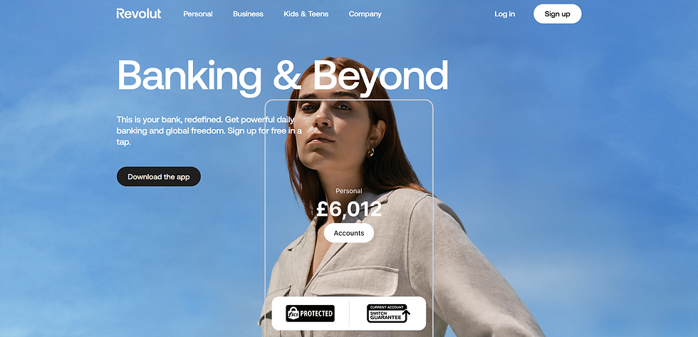
Revolut’s website mirrors its mobile app: bold typography, distinct color blocking, and a single core message per screen. Tiered plans, card options, and fees are structured for clear side-by-side comparison. Security notes appear in early viewports rather than being buried in the footer.
Key Takeaway: Restrict each screen section to one primary value proposition to minimize cognitive load.
Website: https://www.revolut.com/
4. Plaid

Plaid sells trust to a technical audience by replacing vague marketing claims with specific, verifiable numbers (such as network coverage and conversion lift). The user journey segments visitors by industry and use case immediately, guiding fintech founders and bank engineers to tailored landing pages.
Key Takeaway: Swap adjectives for quantifiable metrics. Claims like "25% higher conversion lift" build more trust than "industry-leading results."
Website: https://plaid.com/
5. Klarna

Klarna proves that a fintech brand can be visual and playful without sacrificing clarity. Bold typography and distinctive brand colors build personality, while underlying UI cards keep buy-now-pay-later (BNPL) terms and interest-free repayment schedules simple to digest.
Key Takeaway: Express brand voice through tone and color choice, but keep loan terms, rates, and disclaimers transparent.
Website: https://www.klarna.com/us/
6. Credit Karma

Credit Karma leads with financial education over a direct hard sell. Visual illustrations sit alongside plain-language guides, while personalized credit recommendations appear early to maintain relevance. The mobile-first layout ensures consistency across devices.
Key Takeaway: If catering to financial beginners, implement a progressive disclosure onboarding flow that educates before asking for conversion.
Website: https://www.creditkarma.com/
7. Mercury

Mercury targets tech startups and business owners seeking friction-free banking. The design leverages generous whitespace and a restrained color palette to signal precision and modern security. Primary calls to action (CTAs) remain persistent and uncluttered.
Key Takeaway: Align visual hierarchy with user expectations. B2B financial products should balance sleek modernism with enterprise-grade stability.
Website: https://mercury.com/
8. Chime

Chime speaks directly to everyday banking customers seeking zero hidden fees. The UI uses approachable copy, clear iconography, and gamified progress indicators—such as savings milestones—to make routine banking feel rewarding rather than clinical.
Key Takeaway: Incorporate subtle micro-interactions and progress trackers to make onboarding actions feel clear and encouraging.
Website: https://www.chime.com/
9. Robinhood

Robinhood uses real-time data visualization as a primary storytelling tool. High-contrast live charts, clean typography, and responsive layouts make trading metrics digestible. Displaying real-time market data directly on the homepage serves as a core conversion mechanism.
Key Takeaway: If your application processes changing quantitative data, visualize it dynamically on the landing page.
Website: https://robinhood.com/us/en/
10. N26

N26 applies a minimalist European neobank design to make account opening simple. The onboarding path breaks down step-by-step requirements, displaying compliance and deposit protection details without cluttering the screen with dense legal text.
Key Takeaway: Audit your onboarding flow to identify and eliminate friction points that delay account registration.
Website: https://n26.com/en-eu
Reducing Doubt at Every Touchpoint
High-converting fintech and banking web design focuses on reducing user doubt faster than it can arise. Stripe answers "Does this work?" with real-time product animation. Wise answers "What does this cost?" with an instant calculator. Plaid answers "Is this reliable?" with precise performance metrics.
By addressing security, speed, and clarity up front, these sites turn hesitations into confident user sign-ups.
Frequently Asked Questions
1. What makes a fintech website convert visitors into customers?
A high-converting fintech site removes friction within five seconds through a clear value proposition above the fold, early trust signals, a single primary CTA, and fast page load speeds. Fintech sites convert best when they minimize cognitive load. Presenting security credentials (like SOC2 or FDIC badges), mobile-friendly forms, and transparent pricing prevents drop-offs caused by user hesitation.
2. What are the essential trust signals for banking website design?
Critical trust signals include security badges (encryption, regulatory compliance like FDIC or RBI), specific customer statistics, transparent fee tables, and clear privacy policies. Including verifiable numbers, real customer logos, and visible regulatory backing addresses safety concerns immediately. Missing these signals often causes silent user drop-offs to competitors.
3. How does mobile-first UX impact fintech conversion rates?
Mobile-first design boosts conversions by optimizing high-stakes actions—like identity verification and bank transfers—for single-thumb interaction on mobile screens. With most fintech traffic originating on mobile devices, layouts built around Fitts’s Law (featuring large tap targets, short form fields, and sticky CTAs) prevent user drop-off during registration.
4. What page load speed should a fintech website aim for?
A fintech website should target a Largest Contentful Paint (LCP) under 1.8 seconds and pass Core Web Vitals to maximize user retention and trust. Financial users correlate site latency with technical instability. Compressing assets, optimizing scripts, and leveraging global CDNs prevent bounce rates caused by slow loading times.
5. Why do top fintech companies prefer minimalist design?
Minimalist design reduces cognitive overload, helping users evaluate complex financial details like interest rates, terms, and security features without feeling overwhelmed. Ample whitespace, single-message viewports, and clear typography make financial information easier to process, signaling stability, transparency, and control.
Want a Fintech Website That Converts Like These? Pravaah Consulting builds fintech and banking web experiences engineered around trust, speed, and conversion rate optimization. Schedule a free 20-minute CRO & UX Audit with our team today to eliminate conversion leaks on your homepage.


