
12 Best B2B SaaS Website Designs (2027): UX Strategies That Drive Free-Trial Conversions

Getting visitors to land on your B2B SaaS website is only half the battle. The real challenge begins the moment they arrive: Can your user experience (UX) convince a busy buyer to stop scrolling, trust your platform, and click "Start Free Trial"?
In 2027, standard B2B design patterns are shifting. Buyers no longer want passive, feature-heavy sales pitches. They expect instant visual clarity, interactive product previews, friction-free onboarding, and zero page-load lag.
If your homepage still relies on generic stock imagery or buried sign-up forms, you are leaving valuable recurring revenue on the table.
To help you turn high-intent traffic into active product users, we analyzed top-performing software websites to uncover what actually converts. Here are 12 of the best B2B SaaS website designs in 2026, along with the exact UX strategies driving their free-trial conversion rates.
What Makes a B2B SaaS Website Convert in 2026?
Before jumping into the examples, let's look at the baseline requirements for modern SaaS web design. High-converting B2B sites share five core design principles:
Problem-First Hero Sections: They state the buyer's exact operational frustration immediately, rather than using vague category jargon.
Interactive UI Storytelling: They give visitors a taste of the product experience before asking for a credit card.
Proof Before Claims: Verifiable metric callouts and recognizable client logos appear before high-level promises.
Segmented User Journeys: Clear navigation paths for different buyer roles (e.g., end users vs. executive decision-makers).
Hyper-Frictionless CTAs: Simple 1-click single-sign-on (SSO) options that make starting a trial painless.
Top 12 B2B SaaS Website Designs & Conversion Strategies
1. Attio: The Interactive Product Playground

Industry: AI-Native CRM
Primary UX Mechanism: Light-to-dark transition themes with real-time UI manipulation.
Attio discards static screenshots in favor of dynamic, interactive canvas elements. As visitors scroll, the website demonstrates how easily custom workflows and data attributes can be built inside the platform.
Why It Drives Free Trials: Seeing is believing. By letting prospects virtually "play" with the interface directly on the homepage, Attio removes the anxiety of learning a complex new CRM platform.
Conversion Takeaway: Don't just show static images of your software interface. Build micro-interactions into your page so users experience your product's speed and flexibility before signing up.
Website: Attio: The CRM for agentic revenue
2. Raycast: Instant Value via Keyboard Shortcuts

Industry: Developer Productivity Tools
Primary UX Mechanism: Command-line aesthetic paired with crisp visual hierarchy.
Raycast targets developers and power users who value speed above all else. The homepage replicates the feel of a high-end command palette, using high-impact typography, dark-mode aesthetics, and subtle motion cues.
Why It Drives Free Trials: The site mirrors the product's exact user interface. A visitor immediately realizes that Raycast prioritizes efficiency, resulting in strong product-market-design alignment.
Conversion Takeaway: Design your site's aesthetic to match your software's core brand identity. If your tool focuses on lightning-fast speed, your website's layout, load times, and micro-interactions must reflect that speed.
3. Clay: Modular Card Architecture & Pacing

Industry: AI-Driven Data & Sales Prospecting
Primary UX Mechanism: Soft color gradients, oversized type scale, and self-contained modular cards.
Clay tackles complex software functionality by breaking features down into visual modular cards. Instead of overwhelming visitors with wall-to-wall text, the layout uses warm gradients and balanced spacing to give readers full control over how deep they want to explore.
Why It Drives Free Trials: Complex B2B tools often intimidate prospects. Clay breaks powerful AI capabilities into bite-sized, digestible modules, making a free trial feel manageable.
Conversion Takeaway: Group multi-step platform capabilities into modular, self-contained visual containers so buyers can evaluate features independently without feeling overwhelmed.
Website: Clay | Build systems to grow revenue
4. Linear: Sleek Minimalism That Redefines the Category

Industry: Issue Tracking & Project Management
Primary UX Mechanism: Dark-mode visual elegance, razor-sharp typography, and performance-first animations.
Linear's website design has set the visual standard across modern software verticals. Instead of shouting with aggressive pop-ups or loud callout banners, Linear uses restrained animations and focused hero messaging that speaks straight to software engineers tired of bloated legacy tools.
Why It Drives Free Trials: The site communicates pure software craftsmanship. The smooth user experience reinforces the promise that their app will run just as smoothly.
Conversion Takeaway: Cut unnecessary homepage clutter. If a design visual or animation does not clarify your value proposition, eliminate it to protect page performance and user focus.
5. Ramp: Quantifiable ROI Above the Fold

Industry: Finance & Spend Management
Primary UX Mechanism: Data-heavy proof anchors paired with instant savings calculators.
Ramp knows financial decision-makers care most about saving money and time. Their homepage puts verified metrics, ROI calculators, and customer impact data front and center right below the main headline.
Why It Drives Free Trials: CFOs and finance leaders buy on logic, not emotional hype. By showing exact dollar amounts saved before introducing complex feature lists, Ramp builds instant credibility.
Conversion Takeaway: Lead with verifiable customer proof. Place hard metrics, time-saved statistics, or ROI calculators immediately below your hero headline to validate your claims early.
Website: Spend Management, Corporate Cards & Accounts Payable Solutions | Ramp
6. Huly: Motion-Based Workflow Storytelling

Industry: Open-Source Process & Team Collaboration
Primary UX Mechanism: Dark interface paired with vivid color blocks and fluid scroll interactions.
Huly connects disparate platform features into one seamless narrative. As visitors scroll down the page, animated UI elements lock together dynamically to show how tasks, chat, and project tracking merge into a single environment.
Why It Drives Free Trials: Instead of explaining how different features work, Huly's motion cues demonstrate how the ecosystem solves fragmented daily workflows.
Conversion Takeaway: Use scroll-triggered animations to demonstrate end-to-end user workflows. Show visitors how your product simplifies complex steps into a unified system.
Website: Spend Management, Corporate Cards & Accounts Payable Solutions | Ramp
7. Twingate: Modernizing Security with Visual Trust

Industry: Zero-Trust Network Access (ZTNA)
Primary UX Mechanism: Dark-mode security aesthetic combined with side-by-side legacy architecture comparisons.
Enterprise IT and security software sites often feel dry, heavy, and complicated. Twingate breaks this pattern with a high-contrast dark aesthetic and vibrant accent highlights that instantly convey modern agility.
Why It Drives Free Trials: Twingate displays a side-by-side comparison illustrating how outdated VPN setups fail, followed immediately by their modern alternative. It makes the upgrade path feel necessary and effortless.
Conversion Takeaway: Use visual side-by-side comparisons to highlight the contrast between legacy methods and your modern platform solution.
8. Vercel: Developer-Centric Segmented Journeys

Industry: Frontend Cloud Platform
Primary UX Mechanism: Role-based navigational paths paired with real-time performance previews.
Vercel designs its website around developer workflows. The homepage immediately speaks to technical leads by demonstrating instant deployment capabilities, global edge network performance, and seamless framework integration.
Why It Drives Free Trials: The design provides immediate terminal commands and code previews, allowing developers to start deploying within seconds of clicking the CTA.
Conversion Takeaway: Align your primary conversion CTA with your target audience's native technical habitat, for example, offering sign-ups via GitHub or single-click terminal commands.
Website: Agentic Infrastructure - Vercel
9. Adaline: Serene AI Model Workflow Layouts

Industry: AI Model Training & Development
Primary UX Mechanism: Soft color palettes, structured layout blocks, and high-clarity typography.
AI platforms can quickly become visually overwhelming. Adaline counters this friction by utilizing a clean design palette, ample whitespace, and clean content blocks that create a sense of order.
Why It Drives Free Trials: The calming presentation reassures engineering teams that building, fine-tuning, and evaluating complex AI models need not be chaotic.
Conversion Takeaway: Use strategic whitespace and organized content blocks to make highly technical software feel approachable.
10. Cazena: Performance as a Core UX Metric

Industry: Instant Cloud Data Lakes
Primary UX Mechanism: Blue-dominant color palette, zero visual bloat, and fast-loading page architecture.
Cazena caters to data engineering leads who are skeptical of flash over substance. The site eliminates heavy video backgrounds and slow scripts in favor of ultra-fast load times and clear, directional CTAs.
Why It Drives Free Trials: Technical decision-makers respect page speed. By prioritizing performance, Cazena demonstrates engineering discipline right on their homepage.
Conversion Takeaway: Speed is a key design parameter. Optimize your website's performance by minimizing heavy scripts, as slow load times directly increase bounce rates and erode buyer trust.
Website: Cazena | The First Saas Data Lake
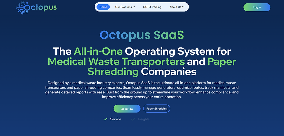
11. Octopus SaaS: Purpose-Built Waste Management Workflow Design
Industry: Waste Management Software
Primary UX Mechanism: Workflow-focused navigation, operational dashboards, and streamlined task management.
Octopus SaaS is designed around the day-to-day workflows of waste management businesses, where scheduling, customer management, compliance, routing, billing, and operational visibility need to work together. Instead of forcing users to move between disconnected tools, a purpose-built platform can organize these functions into a clearer operational experience.
Why It Drives Free Trials: Waste management teams need software that reflects their actual workflows rather than generic business software. When a website clearly demonstrates how the platform handles real operational tasks, prospects can quickly understand its practical value and how it can reduce administrative friction.
Conversion Takeaway: Show the workflow, not just the feature list. Use screenshots, process visualizations, and role-specific journeys to demonstrate how your SaaS product solves the buyer's daily operational problems from start to finish.
12. CeresGrid: Connected Agriculture ERP Experience

Industry: Agriculture ERP & Farm Management Software
Primary UX Mechanism: Industry-specific workflows, centralized operational information, and task-oriented navigation.
CeresGrid focuses on the specialized needs of agriculture businesses by bringing farm management and business operations into a connected software environment. For an industry with complex processes, seasonal activities, field operations, inventory, and business data, the website experience needs to make that complexity understandable without overwhelming prospective users.
Why It Drives Free Trials: Industry-specific SaaS becomes easier to evaluate when prospects can immediately recognize their own workflows and operational challenges. By communicating the connection between farm activities and business management, CeresGrid can make the value of specialized ERP software easier to understand.
Conversion Takeaway: Design SaaS websites around the buyer's real-world workflow. Use clear industry terminology, visual process flows, and specific use cases to help prospects see how the platform fits into their existing operations.
Website: CeresGrid | Hay Export & Supply Chain Management Software
The Seven Mistakes That Quietly Kill Free-Trial Conversion
The fastest way to learn B2B SaaS website design is not just studying the winners. It is watching what gets called out in "roast my landing page" style reviews, where the same handful of mistakes never stop showing up.
Mistake | Why it kills conversion |
|---|---|
The pitch-deck hero | Copy describing what the product is instead of what the buyer gets. Visitors leave unable to explain what you do. |
Features instead of outcomes | Nobody buys a dashboard. They buy knowing which customers will churn this month. |
Fake social proof | Inflated counters and generated testimonials now damage trust faster than showing no proof at all. |
Hidden pricing on a self-serve product | Read by buyers as "the price is whatever the rep thinks you will pay," and treated as an instant exit. |
Template sameness | Identical section rhythm, three-icon feature grids, and glassmorphism tell a buyer the company is interchangeable too. |
Competing CTAs | Multiple equally weighted buttons create decision fatigue instead of one clear next step. |
No product evidence above the fold | Forces the evaluator to keep scrolling on faith instead of seeing proof in the first few seconds. |
The Order We Would Fix a Site In
If your B2B SaaS website isn't converting as it should, start with the cheapest, highest-leverage fixes rather than a full rebuild.
Rewrite the hero against the one-sentence test. Category, buyer, difference—all under ten words. This costs nothing and moves everything else on the page.
Swap adjectives for your strongest true numbers. Whatever scale you are actually at, a real number beats a superlative at that same scale.
Make the pricing decision on purpose. Self-serve motion, publish real numbers. Sales-led motion: gate deliberately and say why in a line of copy.
Move product evidence above the signup form. A screenshot is the minimum, an interactive walkthrough is better, and an explorable demo is best.
Check what an AI agent sees when it reads your site. Clean structure and direct answers now matter for a channel that did not exist two years ago.
Real-World Case Study: How Pravaah Consulting Translates UX Principles into SaaS Conversions
Analyzing the top 12 B2B SaaS website designs provides inspiration, but engineering an intuitive web presence that consistently drives free trials requires experienced strategic execution.
When Pravaah Consulting partners with growing SaaS companies, the goal is straightforward: Eliminate conversion friction and showcase immediate product value.
For instance, when Pravaah Consulting restructured the digital platform architecture for Octopus Tech, the team replaced confusing feature dumps with transparent workflow visualizers and direct trial paths. By aligning the platform's visual hierarchy with user intents, the optimized UX design delivered:
Instant Visual Clarity: Prospects grasp the platform's key benefits within 3 seconds of landing on the page.
Frictionless Onboarding: Simplified navigation routes that guide visitors toward single-click trial sign-ups.
Accelerated Growth: Transitioning concepts into market-ready UI assets that capture recurring revenue faster.
Transform Your SaaS Website with Pravaah Consulting
Creating a high-converting B2B SaaS website requires balancing brand design, user experience architecture, messaging, and search engine visibility.
At Pravaah Consulting, we help B2B software companies turn their websites into predictable user acquisition channels. Our end-to-end services include:
SaaS UI/UX Design & Redesign: Building intuitive website layouts that reduce bounce rates and guide prospects straight to sign-up pages.
Conversion Rate Optimization (CRO): Running data-driven A/B tests to optimize user journeys, call-to-action buttons, and landing page copy.
Search Engine & AI Optimization: Structuring your site's content so high-intent buyers find your product on both traditional search engines and AI discovery platforms.
Common Questions
1. What makes a B2B SaaS website design effective for driving free-trial conversions?
An effective B2B SaaS website design combines a clear value proposition, quick load times, strong social proof, and intuitive navigation. It reduces sign-up friction by showcasing real software UI, offering single-click social sign-ons, and clearly stating "no credit card required" near CTAs.
2. How do interactive product demos impact SaaS conversion rates?
Interactive product previews allow prospective buyers to experience a software platform's core interface and speed before filling out sign-up forms. This hands-on interaction builds trust, lowers perceived onboarding complexity, and drives higher-intent free-trial sign-ups.
3. Why is mobile UX design crucial for enterprise B2B SaaS sites?
B2B buyers frequently conduct preliminary research on mobile devices before moving to desktop evaluation. A responsive, fast-loading mobile UX ensures decision-makers encounter zero navigation friction, keeping your platform on their evaluation shortlist.
4. How does website load speed affect B2B SaaS free-trial sign-ups?
Page load speed directly impacts buyer trust and user retention. Research shows that delays over two seconds significantly increase bounce rates, while fast-loading sites build confidence in your software's underlying performance.
5. Should B2B SaaS websites require a credit card for free trials?
For most product-led growth (PLG) SaaS companies, removing credit card requirements at sign-up significantly increases free-trial conversion volume. Stating "No Credit Card Required" next to your main CTA reduces users' perceived risk and encourages initial trial adoption.
6. How can Pravaah Consulting improve our SaaS website conversion rates?
Pravaah Consulting audits your current user experience, optimizes messaging hierarchies, streamlines trial sign-up flows, and builds high-performing responsive layouts. Our team combines CRO, UI/UX design, and SEO strategy to turn your website into an automated growth engine.


